the firmament
1 motivation
The firmament is the scenery whose purpose is to help establish a sense of space, in particular with respect to the entryway.
Yes, Shakespeare tends to use the term “firmament” only to mean the “place where the stars live.” I’m using the “erroneous” sense that includes the entire expanse from the ground to the heavens.
firmament (n.)
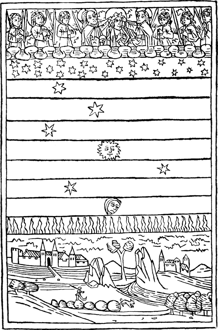
mid-13c., from Old French firmament or directly from Latin firmamentum “firmament,” literally “a support, a strengthening,” from firmus “strong, steadfast, enduring” (see firm (adj.)). Used in Late Latin in the Vulgate to translate Greek stereoma “firm or solid structure,” which translated Hebrew raqia, a word used of both the vault of the sky and the floor of the earth in the Old Testament, probably literally “expanse,” from raqa “to spread out,” but in Syriac meaning “to make firm or solid,” hence the erroneous translation.1
One day, willshake and other dynamic media will actually integrate with the space, and the space you’re actually in will be the canvas. At that point, artificial measures such as this won’t be necessary—or at least will have a different motivation Until then, we’ll do what we can to give people the right idea.
The ground and sky work together to create a sense of being somewhere.
body <append>
	<div id="the-firmament">
		<div id="the-sky" />
		<<the ground>>
	</div>
</append>
In practice, the firmament is more or less fixed, as you might expect.
@import order-of-main-layers
@import docking
@import colors
#the-firmament
	hug-parent(position: fixed)
	overflow hidden     // Prevent reflows when transform transitioning children (Gecko).
	z-index $firmamentLayer        // The ground layer is behind space/time.
	transform translateZ(0)     // HACK for Chrome: Without this, Chrome repaints on every scroll.
	background $skyColor
2 the ground
2.1 the Procession of Shakespeare’s Characters
The sense of a “ground” is created using the painting Procession of Shakespeare’s Characters, which shows a number of notable personalities from the plays milling about in a kind of abstract space.
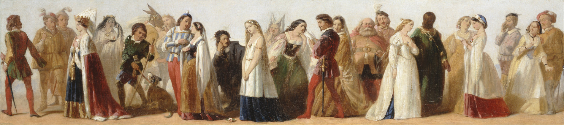
This painting has several fortuitous properties for this purpose, although in theory there are other candidates that might also work if a large enough version were in the public domain. Sylvia Morris presents a good summary of such group portraits2. I also experimented with The Plays of William Shakespeare by John Gilbert, but I prefer the Procession because it is more elliptical—I mean, you can do more with less—and unlike the Gilbert, it creates a sense of open space.
2.2 building the set
Now to set the scene.
<div id="the-ground">
	<div id="the-ground-image" />
</div>
This is already not the structure that you might expect. Why is an <img/>
element (or even a <picture/> element) not used for this image? Because the
ground image—and the firmament generally—belong to the spatial semantics of
the site, not its document semantics. Using stylesheets to present these
effects means that they will be completely invisible to viewers that don’t
support stylesheets (as they should be).
Being agnostic about what may end up on the ground, I’ll give it the full viewport.
@import docking
#the-ground
	hug-parent()
But what is on the ground? For now, just the Procession image.
#the-ground-image
	background url("/static/images/Procession_of_Characters@fullscreen.jpg") no-repeat
	background-size 100%
	<<ground image rules>>
This would be a place to serve a smaller ground image for smaller screens.
The ground is bottom-aligned, naturally. The docking container is the firmament itself—which is fixed in place—so the ground will not move when the user scrolls.
position absolute
bottom 0
But how should it be positioned horizontally? And how wide should it be? The image itself is short and wide, with an aspect ratio of 4.5:1.
width = 6816
height = 1509
Certainly the image should never be narrower than the viewport. It ends abruptly on both sides, and seeing those edges would destroy the illusion. But if it were always flush to both sides (so that you can see the whole thing), then it would end up very short on narrow screens. In such cases it would be preferable to let the image be wider than the viewport, cutting off the sides, rather than letting it shrink to something ridiculous.
In fact, there’s an advantage to letting the image overflow outside of the viewport, even on “normal” sized displays. If there is more image to work with on either side, you can extend the sense of the space by “panning” the ground to the left and right. So I want to guarantee that the image is not visible all at once. Since a very large version of this image is available, this can be done on a wide range of screens.
min-width 125%
The prospect of creating a kind of “stage left” and “stage right” suggests that image should be centered horizontally.
@import centering
horizontally-center()
All that aside, the image works best when it’s about half of the height of the screen. But I can’t specify a height constraint directly, for reasons that will be apparent in a moment. That’s no problem, since I know the aspect ratio of the image, and I can express the width in terms of the viewport height.
width (width / height) * 50vh
All of this means that the size of the image will often change if the shape of the viewport changes. When that happens, the adjustment should not be abrupt.
transition width .2s
Finally, an implementation detail. Since the ground-image element is empty, it
doesn’t have a “natural” height. It has to be assigned a height somehow.
Luckily, it’s easy in CSS to make a variable-width maintain a specific aspect
ratio. Maybe not in the way that you’d expect, but easy
nonetheless.3
&:before
	content ''
	display block
	padding-top (height / width) * 100%
With that, the height of the box will always match the correct height of the image, no matter what its width is set to.
You might be thinking that all that could have been achieved more easily with
just CSS background-size and background-position rules. But it will be useful
to have a container that is coextensive with the actual image (as opposed to
just its visible part). This is also gives a much better prospect for swift
panning left and right, since transitioning elements can be hardware
accelerated, which I’m assuming that background styles cannot.
2.3 blending with the sky
The ground image appears to sit against a continuous “sky.” A little horizontal
strip helps create that effect by blending the top of the image with the
background. Using an :after so it is naturally on top.
@import docking
@import colors
&:after
	dock-top()
	content ''
	height 9%
	background-image linear-gradient(rgba($skyColor, 1), rgba($skyColor, 0))
3 the sky
The very rearmost layer, the “sky” is just a gradient that resides behind the Procession image and sets the background color for the space.
// Sky colors are defined in lib/colors.
@import colors
#the-sky
	hug-parent()                            // the parent (the firmament) is already fixed position
	// CHEATING: hardcoding the height of the image
	height calc(100% - 332px)
	background-image linear-gradient($nightSkyColor, $skyColor 66%)
This darkens the top of the sky, in a way that should still blend with the ground image. It adds contrast to the beacon and adds a bit more depth to the space.
4 issues
4.1 BUG ugly gap when browser chrome goes away
Firefox Android, in particular, does this annoying thing where it changes the height when you scroll down. Yes, this gives you full screen, but it wreaks all kinds of havoc on height-dependent things.
And in this case, you get a white gap where there’s suddenly new viewport space.
So shouldn’t the body just have a background to match the sky color?
4.2 TODO serve a smaller ground image for smaller screens
Footnotes:
See “Picturing Shakespeare’s Characters” from The Shakespeare Blog by Sylvia Morris (January 2014).
The trick is that percentages used for vertical rules
(such as padding-top and padding-bottom) are based on the width of the element,
not (as you might expect) the height. Note that this has to be done with a
pseudo element so that the percentage is based on the ground’s width, not its
container’s (the viewport).